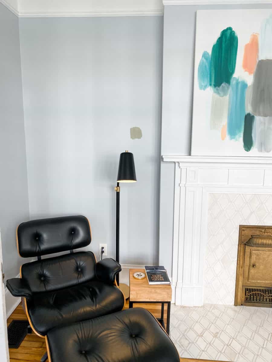
Well, that didn’t take long. I suppose I should have done a tester before I mocked up the boards for the parlor refresh. What looks good on paper does not always look good on the walls. French Gray is out… but here is what I’m considering and why the change.
I recently learned about LRV in paint. LRV stands for Light Reflective Value, it’s a meter to allow you to gauge how much light a paint color will absorb or reflect. The lower the number, the more light-absorbing (i.e. darker), and the higher the number, the more reflective (i.e. lighter) the color will look.
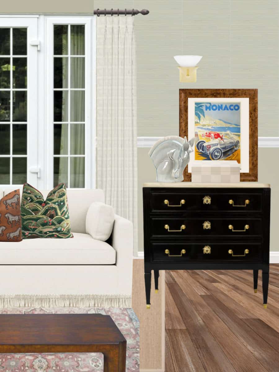
When I first set off on refreshing the parlor, I wanted 1920s drama and glamour with dark walls and maybe even painting the ceiling the same shade. However, one of the major draws to this room is how light, bright, and inviting the space is. So now I’m thinking we should make the furniture the drama and keep the walls light.
As soon as I painted French Gray on the walls I knew it was not for me nor for this room. No shade to F&B but the color looks like baby poop and is not dynamic or pretty at all. It has an LRV in the mid 40’s so it’s considerably darker than what we have on the walls now (Reflection by Sherwin Williams).
I was thinking of using F&B because of its low VOC rating and because it’s the “trendy” interior designer brand that all the top designers gravitate to… alas I am a Sherwin Williams girl.
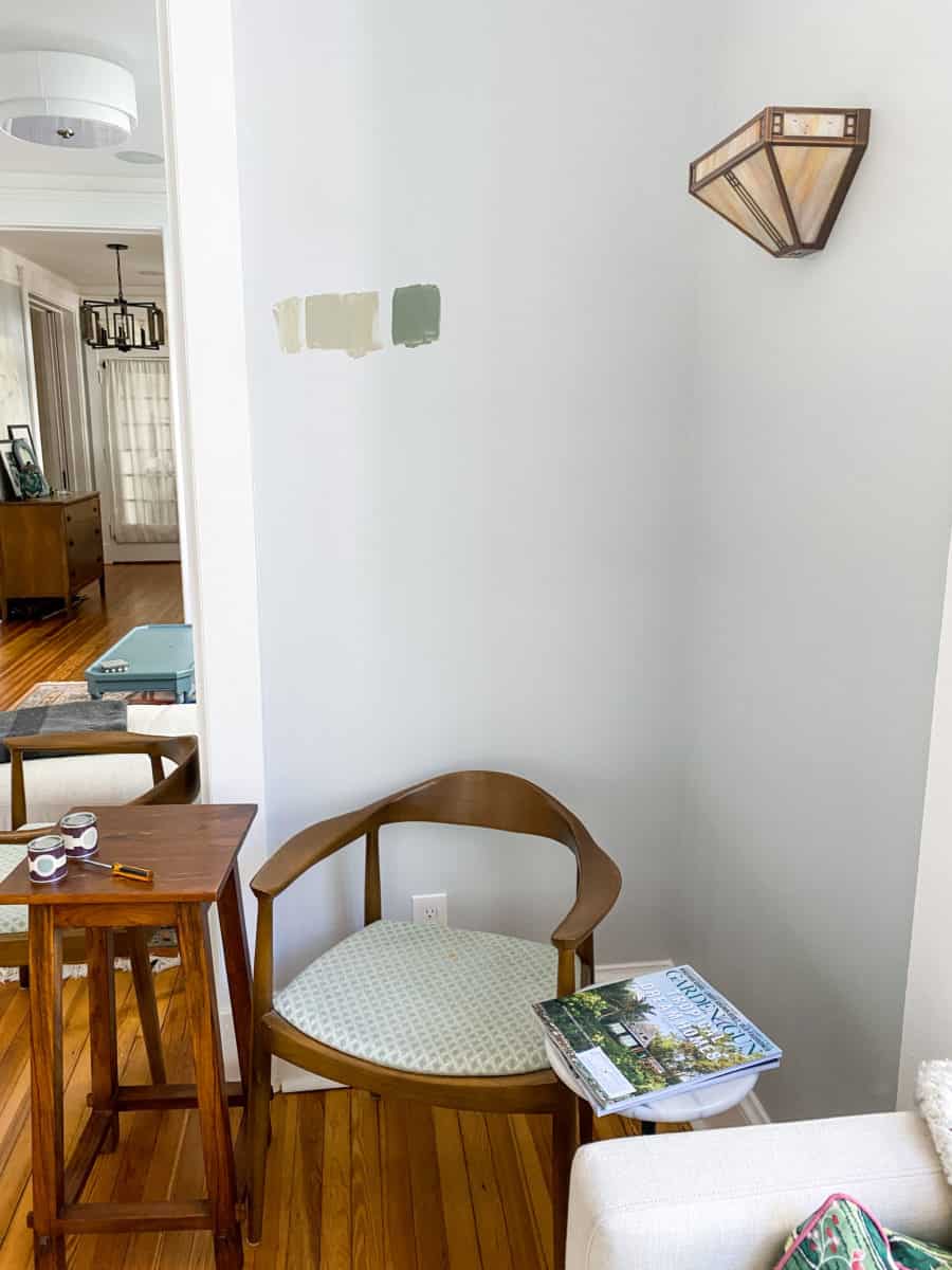
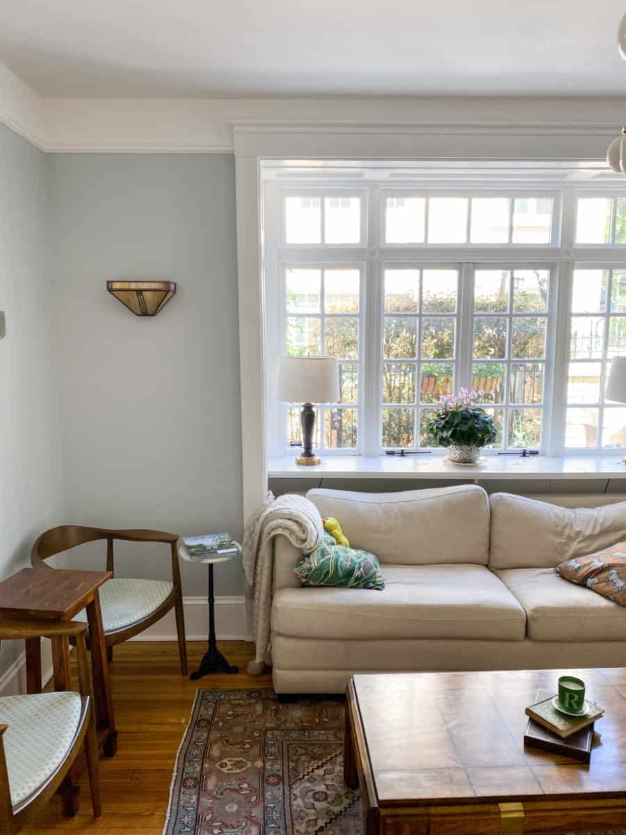
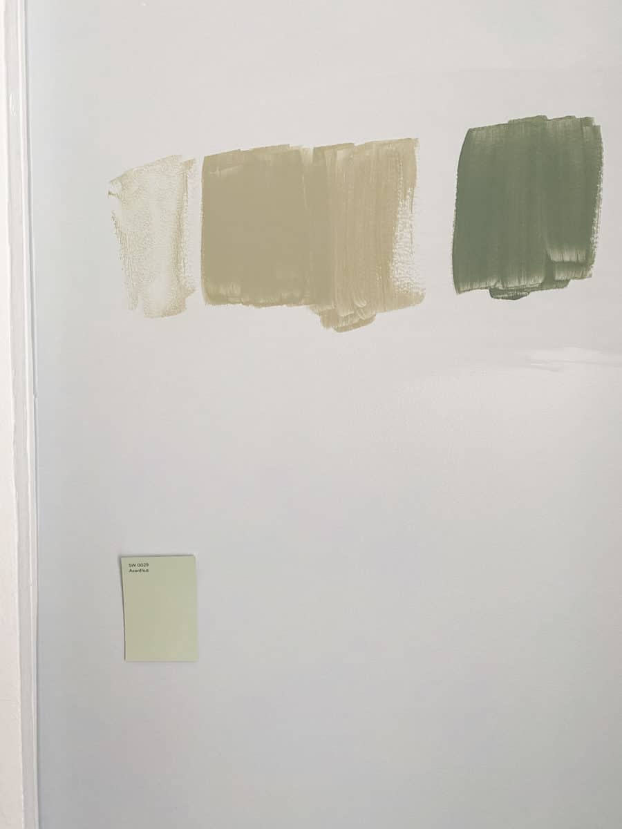
After the snafu of painting a tester on every wall in the parlor (I gotta know how it looks in the corners, obviously), I ran to my closest Sherwin Williams to explore the pain section.
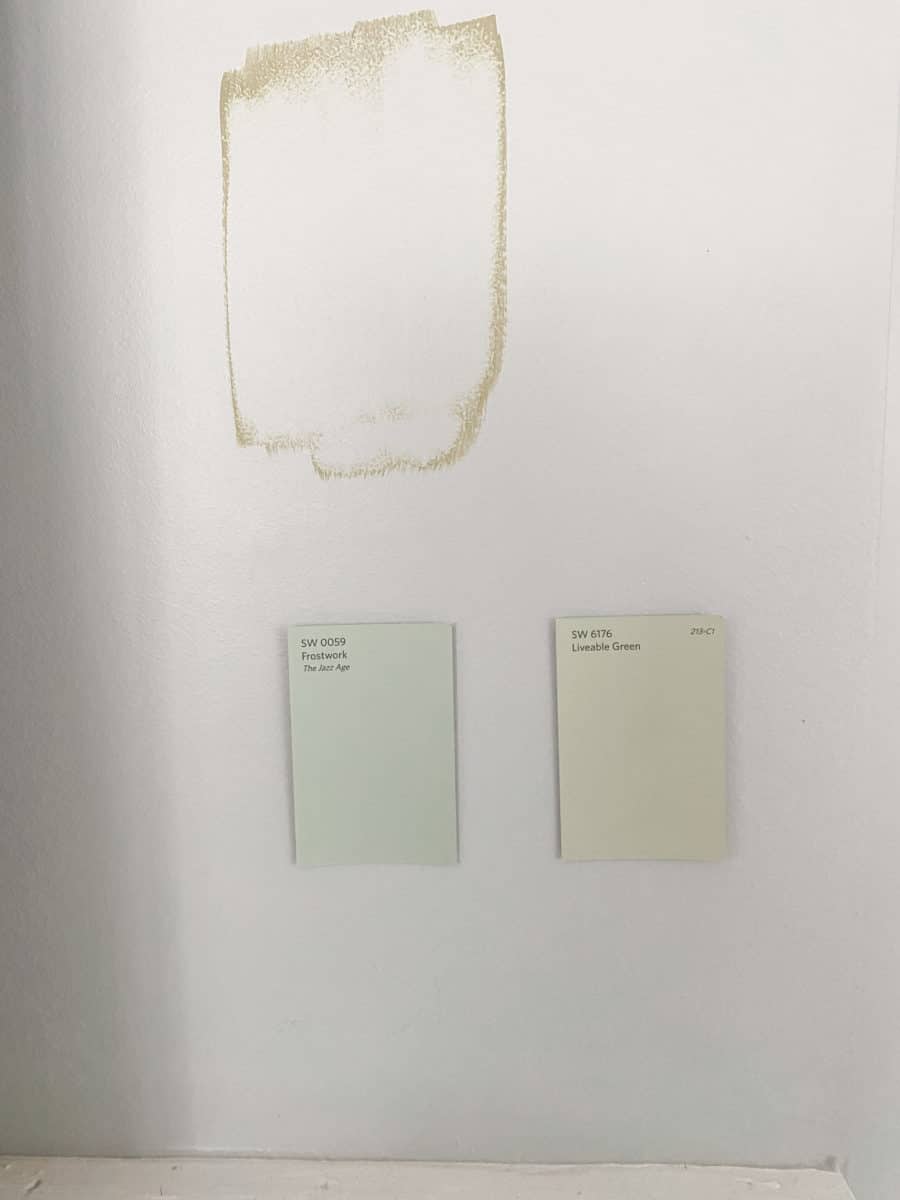
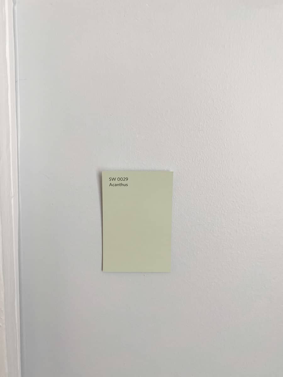
I narrowed it down to three greens: Acanthus, Frostwork, and Liveable Green. Frostwork is a period-appropriate paint color so I’m leaning towards that. All of these colors have an LRV of 60+ and look light on the walls. I’m especially interested in Frostwork because it looks like a twinge of difference from Reflection and will be a nice transition from the living room to the parlor.
This paint will also be going over grasscloth wallpaper (specifically the Plain Grass from Calico) so I need to pay attention to how the grooves in the paper will affect the paint (i.e. create more shadows). I think the paint is going to look great but it won’t be going on until the final week once I have a chance to install the grasscloth.
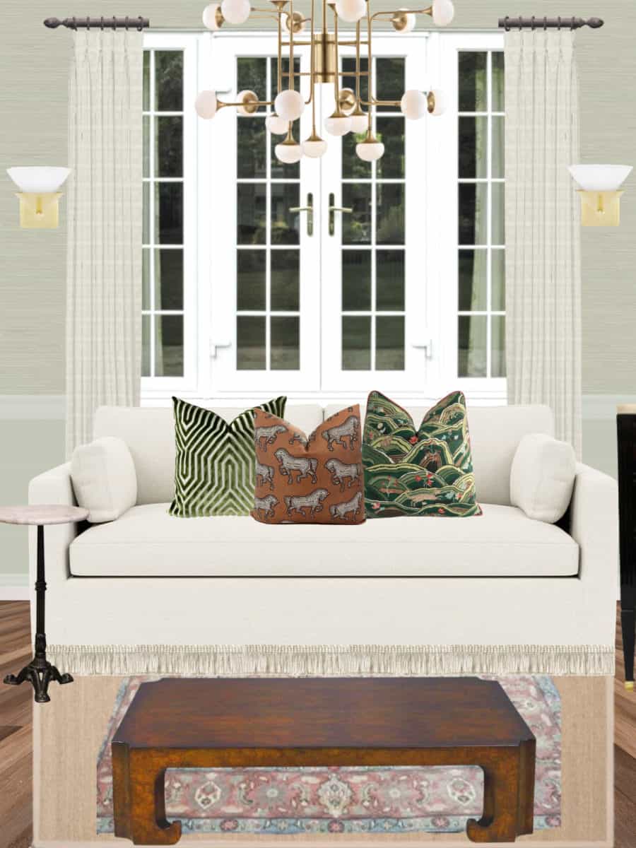
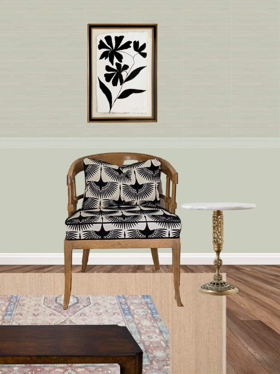
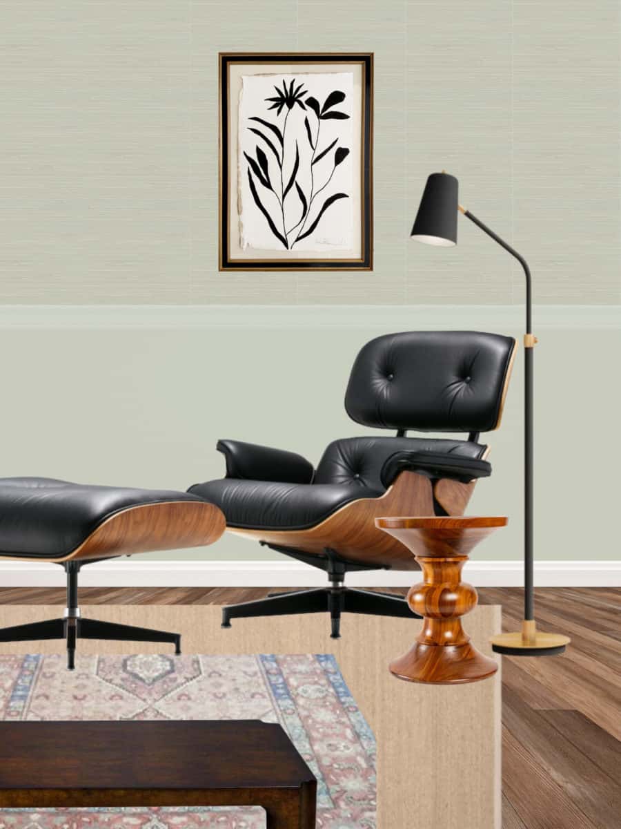
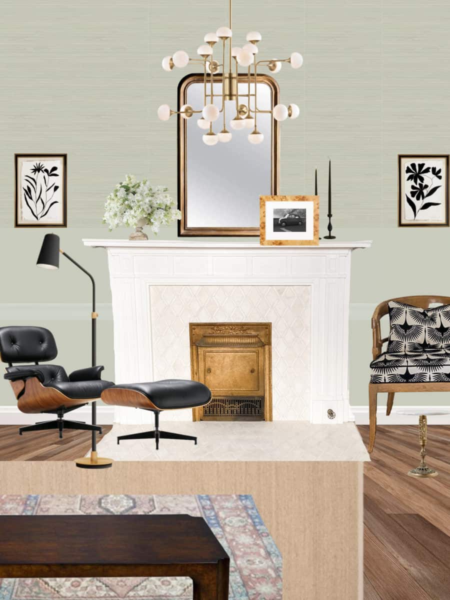
Here are the mockups with Frostwork! It looks much more appealing than French Gray already. Let’s do this!
Spring 2022 One Room Challenge Week One Here