
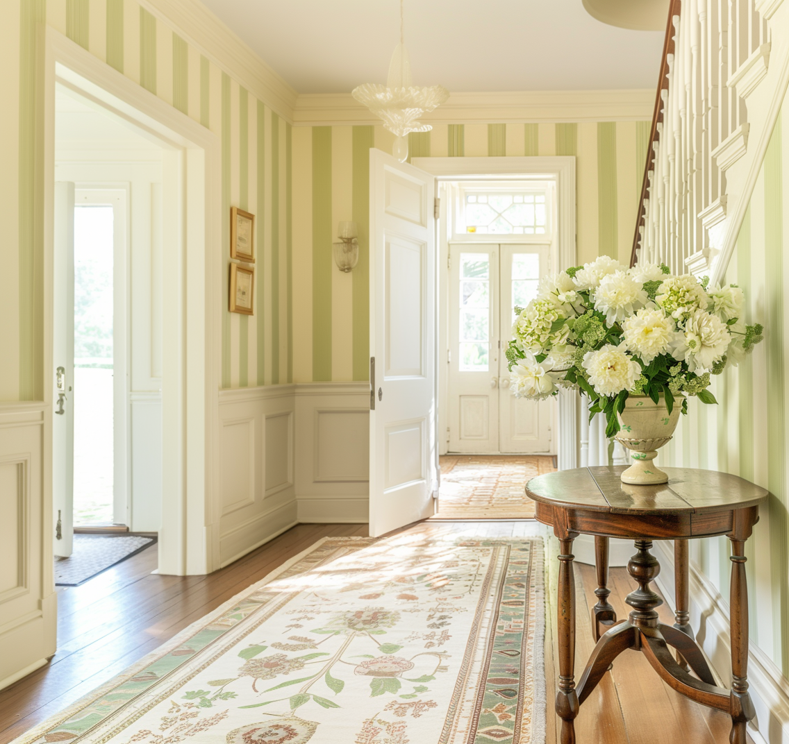
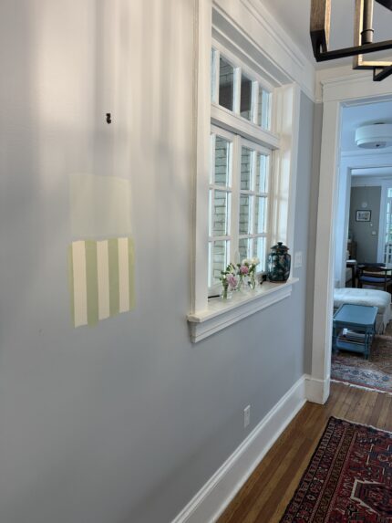
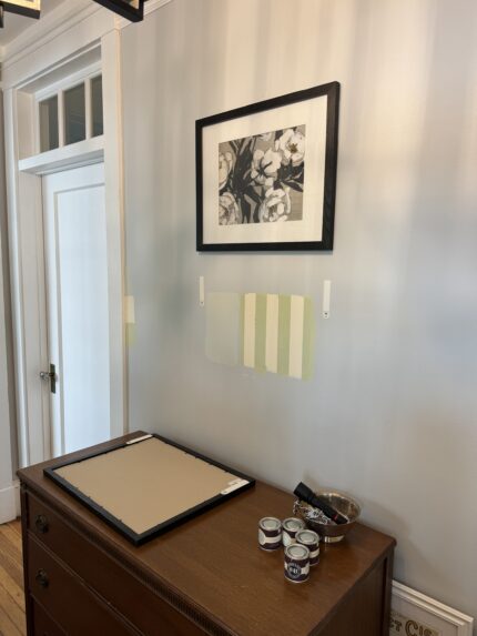
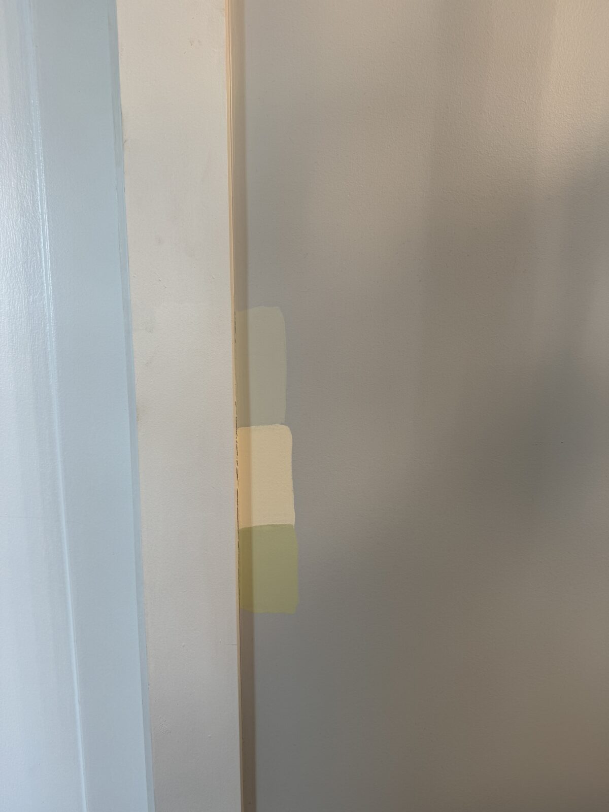
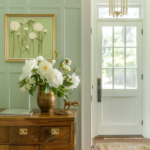
Last week I had a chance to test swatch some of the colors I wanted to use for the Foyer refresh. As mentioned in the kickoff post, I was thinking about recreating Farrow & Ball’s Closet Stripe with paint or using Pale Powder. I wanted to do something bold, but after swatching this area I had to ask myself, am I really that bold?
(AI generated image created for this project)
As I embrace bolder fashion choices once again, I still find myself still drawn to subtlety in home design. I’m a modern traditionalist at heart attempting to blend my husband’s preference for minimalist mid-century design. As mentioned previously, this foyer was going to be the “test” if we wanted to carry this design over into the next house, and, while I still love the yellow and green stripe, I just have to pass on using it for this room.
Our foyer’s layout bridges the white dining room and muted blue living room in an oversized transitionway hallway. It really tested my willingness for boldness. The striking stripe would really smack you in the face as you walk into the house, and I want the house to slowly pull you in as you cross the threshold.
So, in an unsurprising end, I will be moving forward with Pale Powder.
However, if you plan on test swatching a space in your house, here are my best practices for ensuring you like the color:
- Test swatch on every wall to ensure that the color doesn’t get too grayed out or reflect a different shade in different lighting
- Test swatch next to the trim. If your trim isn’t white, you’ll especially want to ensure the color you’ve chosen doesn’t clash.
- Test swatch somewhere you can hide the color. I test swatched under the existing art so I can see how the color looks at any time of the day without it being completely visible at all times. (Speaking from experience, I know test swatches can hang around longer than you plan before you get to painting, so it’s nice to hide it.)
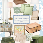
If you’re curious about the colorways for the test swatches, I’ve listed them below.


Your Farrow and Ball paint selections are going to feel so luxurious! Great tips for all of us regarding testing paint swatches. Looking forward to seeing more!